


If you’ve ever wondered What Is a Candlestick Chart and How to Read It Like a Pro, you’re in the right place! Candlestick charts are one of the most powerful tools in the world of stock trading, forex analysis, and cryptocurrency investing—but many beginners find them confusing at first glance. What makes these charts so special, and how can you unlock their secrets to make smarter, data-driven decisions? Stick around, because this guide will break down everything you need to know about candlestick chart reading in a simple, step-by-step way.
At its core, a candlestick chart is a visual representation of price movements over a specific period, packed with crucial information like opening, closing, high, and low prices. But why do traders and investors swear by candlestick patterns? These charts don’t just show numbers; they tell a story of market sentiment and momentum that can reveal buy or sell signals with incredible accuracy. Whether you’re looking to master technical analysis or aiming to enhance your trading strategy, understanding how to read these charts like a pro can give you a serious edge.
So, how exactly do you decode a candlestick chart? From recognizing popular patterns like doji, hammer, or engulfing candles, to interpreting color-coded price action, this article will guide you through the essentials of candlestick chart interpretation. Get ready to transform complex data into actionable insights and elevate your financial game to the next level. Curious to learn the secrets behind the charts? Keep reading and discover how to become a confident, savvy trader with candlestick charts!
Unlocking the Secrets: What Is a Candlestick Chart and Why Every Trader Must Master It
Unlocking the Secrets: What Is a Candlestick Chart and Why Every Trader Must Master It
If you ever been curious about how traders predict the forex market moves or stocks, you probably heard about candlestick charts. But what is a candlestick chart and how to read it like a pro? This tool is one of the most popular and powerful ways to analyze price action in financial markets. It provides visual details that simple line charts can’t show, making it an essential skill for any trader wanting to succeed.
What Is a Candlestick Chart?
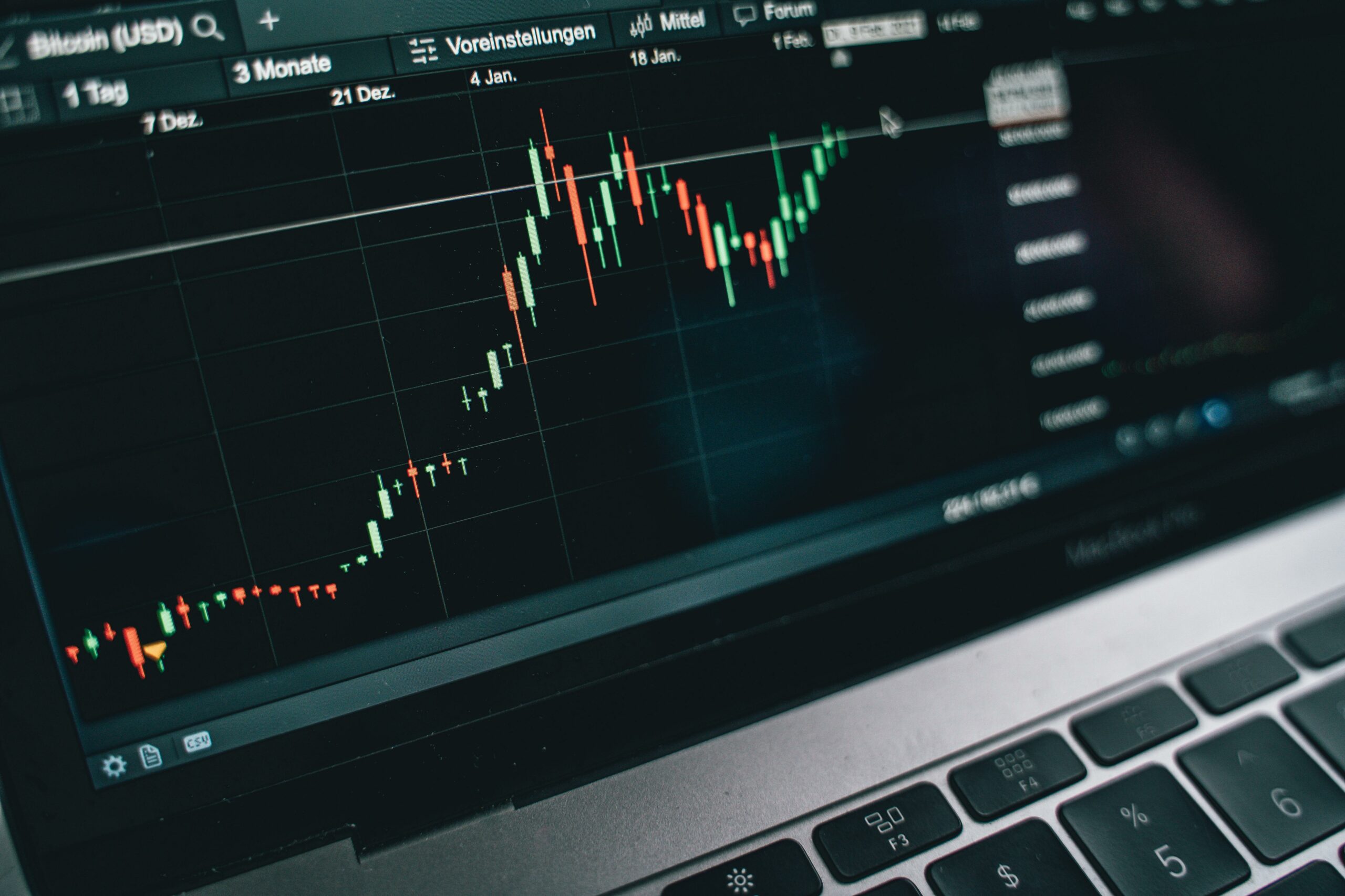
A candlestick chart is a type of financial chart used to represent price movements of an asset over a specific time period. Each “candlestick” shows four main price points: the opening price, closing price, highest price, and lowest price during that time frame. Unlike simple line charts that just connect closing prices, candlestick charts give more info about the battle between buyers and sellers.
These charts originated in Japan during the 18th century, invented by a rice trader named Munehisa Homma. He discovered that market psychology influenced price movement, and the candlesticks helped him visualize this better than traditional charts. Today, nearly every trader worldwide uses this method, especially in forex and stock markets.
How to Read a Candlestick Chart Like a Pro
Reading a candlestick chart involves understanding the shape and color of each candle and what it implies about market sentiment. Here’s what you need to look at:
- Body: The thick part of the candle shows the difference between opening and closing prices. If the body is filled or red (depends on the chart settings), it means the price closed lower than it opened — indicating selling pressure. If it’s hollow or green, it closed higher, showing buying pressure.
- Wicks (or shadows): The thin lines above and below the body indicate the highest and lowest prices during that period.
- Length of the body: A long body shows strong buying or selling activity, while a short body suggests indecision or consolidation.
- Length of the wicks: Long wicks mean rejection of higher or lower prices and potential reversals.
Popular Candlestick Patterns Every Trader Should Know
Candlestick charts are useful not just for showing prices but also for spotting patterns that hint at future price moves. Here are few common ones:
- Doji – The opening and closing prices are almost equal. It shows indecision in the market and potential reversal.
- Hammer – Small body with a long lower wick. It often signals a bullish reversal after a downtrend.
- Shooting Star – Small body with a long upper wick, usually indicating bearish reversal after uptrend.
- Engulfing Patterns – When a small candle is followed by a larger candle that ‘engulfs’ it, suggests a strong reversal signal.
- Morning Star and Evening Star – Three-candle patterns that indicate bullish or bearish reversals respectively.
Why Every Trader Must Master Candlestick Charts
Many traders skip this step and just rely on indicators or news, but mastering candlestick charts give you a deeper understanding of market psychology. Here’s why it’s important:
- Visual clarity: You can see immediately who is dominating the market, buyers or sellers.
- Better timing: Candlestick patterns help you enter and exit trades at the right moments.
- Risk management: They help identify potential reversals or continuations, reducing losses.
- Works with any market: Whether forex, stocks, commodities, or crypto, candlestick charts are universally applicable.
- Enhances other analysis tools: Combine candlestick reading with trendlines, volume, and indicators for stronger trade decisions.
Comparing Candlestick Charts With Other Chart Types
It’s worth knowing how candlestick charts stand next to others you might use:
| Chart Type | Shows Price Action | Visual Detail | Ease of Interpretation | Best For |
|---|---|---|---|---|
| Line Chart | Closing prices only | Low | Simple | Beginners, overview |
| Bar Chart | Open, high, low, close | Medium | Moderate | More detail than line |
| Candlestick Chart | Open, high, low, close | High | Intuitive, visual | All traders, detailed |
Candlestick charts combine the best of line and bar charts by offering a clear, color-coded view that’s easy to interpret even for beginners once you get the hang of it.
Practical Tips for Using Candlestick Charts in Forex Trading
To use candlestick charts effectively, consider these tips:
- Always look at the bigger picture: Check multiple timeframes before making a decision.
- Confirm patterns with volume or other technical indicators.
- Don’t trade just by pattern alone — market context matters a lot.
- Practice reading charts on demo accounts to
How to Read a Candlestick Chart Like a Pro: Step-by-Step Guide for Beginners
When you start trading forex, one of the most important tools you will encounter is the candlestick chart. Many beginners find these charts confusing at first glance, but learning how to read a candlestick chart can give you powerful insight into market behavior. In this article, we will explore what a candlestick chart is, how it works, and provide you with a step-by-step guide to read it like a pro—even if you are just starting. Understanding this can make your trading decisions more informed and precise, which is crucial in fast-paced environments like New York’s forex market.
What Is a Candlestick Chart?
A candlestick chart is a type of financial chart used to describe price movements of an asset, such as currency pairs in forex. Unlike line charts that only show closing prices, candlestick charts display four key pieces of information for each time period: the opening price, closing price, highest price, and lowest price. This makes them much more detailed and useful for traders.
The history of candlestick charts dates back to the 18th century in Japan, where a rice trader named Munehisa Homma created this method to analyze rice prices. The technique was then introduced to Western traders in the late 20th century, and now it is one of the most popular chart types worldwide.
The Anatomy of a Candlestick
To read a candlestick chart properly, you need to understand the structure of a single candlestick. Each candlestick consists of the following parts:
- Body: The thick part represents the price range between the opening and closing prices.
- Wicks or Shadows: Thin lines above and below the body showing the highest and lowest prices during the period.
- Color: Usually, green or white means the price closed higher than it opened (bullish), while red or black means the price closed lower than it opened (bearish).
Here’s a simple table to illustrate:
| Part | Description |
|---|---|
| Body | Distance between open and close price |
| Upper Wick | Highest price reached during the timeframe |
| Lower Wick | Lowest price reached during the timeframe |
| Color | Indicates market movement direction |
Step-by-Step Guide to Read a Candlestick Chart Like a Pro
Reading candlestick charts takes some practice, but if you follow these steps, you’ll be better prepared to analyze market trends.
Identify the Timeframe
Candlestick charts can represent various timeframes – one minute, five minutes, hourly, daily, and more. Always check the timeframe first because it changes the context of the chart. For example, a one-hour candle shows price action within that hour, while a daily candle summarizes the whole day.Look at the Color and Size of the Candlestick
A long green candle indicates strong buying pressure, while a long red candle shows strong selling pressure. Small bodies mean indecision or consolidation in the market.Examine the Wicks
Long upper wicks suggest sellers pushed prices down from the high, and long lower wicks indicate buyers pushed prices up from the low. Candles with long wicks on both ends often mean the market is uncertain.Spot Patterns
Candlestick patterns help predict possible price reversals or continuations. Common bullish patterns include “Hammer” and “Morning Star,” while bearish ones include “Shooting Star” and “Evening Star.”Confirm with Volume and Other Indicators
Never rely on candlesticks alone. Always check trading volume or combine with other technical indicators like moving averages or RSI for stronger signals.
Common Candlestick Patterns Every Beginner Should Know
Being able to recognize candlestick patterns can boost your trading strategy. Here are some basics:
- Hammer: Small body, long lower wick, appears after a downtrend; potential bullish reversal.
- Shooting Star: Small body, long upper wick, found after an uptrend; possible bearish reversal.
- Doji: Very small body with wicks; signals market indecision.
- Engulfing Pattern: A larger candle completely ‘engulfs’ the previous one, showing strong momentum shift.
Comparing Candlestick Charts with Other Chart Types
Many traders wonder if candlestick charts are better than bar charts or line charts. Here’s a quick comparison:
- Line Charts: Simple, showing only closing prices; less informative.
- Bar Charts: Similar info as candlesticks but less visually intuitive.
- Candlestick Charts: More visual, easier to spot patterns and trends quickly.
Because of their visual clarity, many professional traders prefer candlestick charts for making quick decisions especially in highly volatile markets like forex.
Practical Example: Reading a Candlestick Chart for EUR/USD
Imagine you are watching the EUR/USD currency pair on a 1-hour candlestick
Top 7 Powerful Candlestick Patterns to Watch for Smarter Trading Decisions
In the fast-paced world of forex trading, knowing when to enter or exit a trade can make a huge difference in your profits. One of the most popular tools that traders around New York and beyond use is the candlestick chart. But, what is a candlestick chart and how to read it like a pro? Understanding candlestick patterns helps traders to make smarter decisions by analyzing market sentiment visually. This article dives into the basics of candlestick charts, explores the top 7 powerful candlestick patterns every trader must watch, and gives you practical tips to boost your trading strategy.
What Is a Candlestick Chart and How to Read It?
Candlestick charts originated in Japan hundreds years ago, used initially by rice traders to track prices. Unlike simple line charts, candlestick charts show more information about price movements within a specific time frame. Each “candlestick” represents four important price points: the opening price, closing price, highest price, and lowest price during that period.
A typical candlestick has a body and wicks (also called shadows). The body shows the difference between opening and closing prices. If the closing price is higher than the opening, the candlestick is usually colored green or white, signaling bullish behavior. Conversely, if the closing price is lower, the body is red or black, indicating bearish movement. The wicks tell you how far prices have moved beyond the open and close, showing market volatility.
Reading a candlestick chart involves observing these shapes and colors to infer what traders are feeling. Bulls (buyers) push prices up, bears (sellers) push prices down, and the tug-of-war between them is reflected visually. With practice, you can predict potential reversals or continuation of trends by spotting specific candlestick patterns.
Top 7 Powerful Candlestick Patterns to Watch for Smarter Trading Decisions
Knowing candlestick patterns is like having a secret decoder for market psychology. Here are seven must-know ones:
Doji
- Appearance: Very small body, almost like a cross or plus sign.
- Meaning: Indicates indecision between buyers and sellers.
- Practical Use: Often signals a potential reversal, especially after strong trends.
Hammer and Hanging Man
- Appearance: Small body with a long lower wick.
- Meaning: Hammer appears at a downtrend bottom, signaling bullish reversal. Hanging man shows up at an uptrend top, warning of bearish reversal.
- Practical Use: Confirmation with next candlestick is important before acting.
Engulfing Pattern
- Appearance: One candle’s body completely engulfs the previous candle’s body.
- Meaning: Bullish engulfing suggests a trend reversal to the upside; bearish engulfing signals a reversal downwards.
- Practical Use: Strong indication of momentum change.
Shooting Star
- Appearance: Small body with a long upper wick.
- Meaning: Appears after an uptrend, suggests sellers are taking over.
- Practical Use: Watch for confirmation to avoid false signals.
Morning Star and Evening Star
- Appearance: Three-candle patterns; morning star occurs at bottom, evening star at top.
- Meaning: Morning star points to bullish reversal; evening star warns bearish reversal.
- Practical Use: Useful for spotting trend changes early.
Harami
- Appearance: Small body inside the previous large body.
- Meaning: Indicates potential reversal or pause in trend.
- Practical Use: Often seen as a warning sign, but further confirmation is needed.
Marubozu
- Appearance: Long body with little or no wick.
- Meaning: Strong trend indication; bullish Marubozu means buyers dominated, bearish means sellers dominated.
- Practical Use: Good for confirming trend strength.
How Candlestick Patterns Compare to Other Chart Types
Unlike bar charts or line charts, candlestick charts provide richer visual cues due to their color-coding and shape variations. For example:
- Line charts only show closing prices, so you miss out on intraday highs and lows.
- Bar charts show similar data but lack the immediate visual impact that candlesticks provide.
- Candlesticks allow traders to quickly gauge market sentiment without needing complex indicators.
Because of this, many forex traders in New York prefer candlestick charts for quick decision-making during volatile market hours.
Practical Example: Using Candlestick Patterns in Forex Trading
Imagine EUR/USD is in a downtrend, and suddenly you spot a hammer candlestick forming after a long series of red candles. This small body with a long lower wick suggests the sellers tried to push prices lower but buyers stepped in strongly. If the next candle confirms with a green body, it might be a good chance to enter a buy trade, anticipating a reversal.
Similarly, spotting a bearish engulfing pattern near a resistance level could warn you that the upward momentum is fading, and you might
Candlestick Chart Basics Explained: Understanding Price Movements and Market Trends
When it comes to understanding the forex market, one tool that traders cannot ignore is the candlestick chart. This type of chart has been around for centuries, originally used by Japanese rice traders in the 18th century, and today it remains one of the most popular ways to analyze price movements and market trends. But what is a candlestick chart and how to read it like a pro? Many beginners find themselves confused by all those colorful bars and lines, but once you grasp the basics, it becomes a powerful method to decode market sentiment.
What Is a Candlestick Chart?
A candlestick chart displays the price action of an asset over a specific time period. Each “candlestick” represents four important data points: the open, high, low, and closing prices within that timeframe. Unlike line charts that only show closing prices, candlestick charts give you a fuller picture of the price behavior during the session. This is why many forex traders prefer them as it helps to understand the dynamics behind price changes.
Each candlestick consists of two main parts:
- The Body: This is the thick part of the candlestick and shows the price difference between the open and close.
- The Wicks (or Shadows): These are the thin lines extending above and below the body, representing the highest and lowest prices reached during the period.
If the closing price is higher than the opening price, the body typically appears green or white, indicating bullish movement. Conversely, if the close is lower than the open, the body is red or black, signaling bearish sentiment.
How to Read a Candlestick Chart Like a Pro
Reading candlestick charts is not just about recognizing colors or shapes. It involves interpreting patterns and understanding what market participants are likely thinking during those price moves. Here are some key points to help you become more confident:
- Identify the Trend: Before focusing on individual candles, look at the overall trend. Is the market moving up, down, or sideways? Trends give context to candlestick patterns.
- Observe Candle Size: Large bodies usually indicate strong buying or selling pressure, while small bodies suggest indecision or consolidation.
- Look at Wick Length: Long upper wicks often mean sellers pushed prices down from highs, while long lower wicks imply buyers stepped in to support prices.
- Recognize Patterns: There are many candlestick patterns that traders use to predict price reversals or continuations. Some popular ones include:
- Doji: When open and close prices are almost the same, signaling indecision.
- Hammer: A small body with a long lower wick, often a bullish reversal sign after a downtrend.
- Engulfing Pattern: One candle completely engulfs the previous one, indicating a possible trend change.
Historical Context and Importance of Candlestick Charts
Candlestick charts were invented by a Japanese rice trader named Munehisa Homma in the 1700s. He discovered that patterns in price movements could predict future market behavior. This was revolutionary at the time because most market analysis relied only on volume or simple price averages. Today, candlestick charting techniques are combined with other technical analysis tools like moving averages, RSI, and MACD for more comprehensive market insights.
The visual nature of candlesticks makes them easier to interpret than raw data tables or simple line charts, which is why they have become a staple for forex traders all over the world, especially in fast-paced markets like New York.
Practical Examples of Candlestick Use in Forex Trading
To put theory into practice, here’s an example of how a forex trader might use candlestick charts:
- Suppose the EUR/USD pair is in a downtrend. Suddenly, a hammer candle forms on the daily chart with a long lower wick. This could suggest that sellers pushed prices down, but buyers returned strongly before the close.
- The trader might wait for confirmation by observing if the next candle closes higher, signaling a potential reversal.
- Using this signal, the trader may enter a long position with a stop loss below the hammer’s low to manage risk.
Simple Comparison: Candlestick vs. Other Chart Types
| Chart Type | Pros | Cons |
|---|---|---|
| Line Chart | Easy to read, shows closing prices | Lacks detailed price info |
| Bar Chart | Shows open, high, low, close | Can be complicated for beginners |
| Candlestick Chart | Visual, detailed, shows market sentiment | Can be overwhelming at first |
Candlestick charts offer more detailed information than line charts and are more visually intuitive than bar charts, which is why they are often recommended for traders who want to understand market psychology better.
Bullet Points on Why Candlestick Charts Are Useful
- Show detailed price action within a given time frame.
- Help identify market sentiment quickly.
- Allow spotting of potential reversals or trend continuations.
Why Candlestick Charts Are Essential for Forex and Stock Market Analysis in 2024
Why Candlestick Charts Are Essential for Forex and Stock Market Analysis in 2024
In the fast-moving world of forex and stock markets, traders and investors need tools that help them understand price movements quickly and accurately. Candlestick charts have become one of the most essential tools in this field, especially in 2024 when markets are more volatile and complex than ever before. Many beginners and even some seasoned traders still wonder, what is a candlestick chart and how to read it like a pro? This article will break down the basics of candlestick charts, why they have stood the test of time, and how you can use them effectively for market analysis today.
What Is a Candlestick Chart?
A candlestick chart is a type of financial chart used to describe price movements of securities, derivatives, and currencies over a specific time period. Originated in Japan centuries ago, it was first developed by rice traders to track and predict market prices. The chart displays four crucial pieces of data for each time unit: open, high, low, and close prices. Unlike simple line charts that only show closing prices, candlesticks give traders more detailed visual cues about the market sentiment.
Each candlestick looks like a rectangular box, called the “body,” with lines extending above and below known as “wicks” or “shadows.” The body represents the range between the opening and closing prices, while the wicks show the highest and lowest prices reached during the time period. When the close price is higher than the open, the candlestick is usually colored green or white, indicating bullish movement. Conversely, if the close is lower than the open, the candlestick is often red or black, signaling bearish pressure.
Why Candlestick Charts Are Vital in 2024 Forex and Stock Analysis
Candlestick charts have been popular for decades, but their importance grows especially in 2024 due to several factors:
- Enhanced Market Volatility: With geopolitical tensions, economic uncertainties, and rapid technological changes, price swings are more frequent and dramatic. Candlesticks help traders spot these changes in real-time.
- Better Visual Representation: Compared to other chart types, candlesticks provide an immediate sense of market dynamics, showing not only price direction but also strength and momentum.
- Pattern Recognition: Traders use candlestick patterns to predict future price movements. These patterns have been tested over time and across assets, making them reliable indicators.
- Compatibility with Technical Indicators: Candlestick charts can be combined with moving averages, RSI, MACD, and other tools to create a more comprehensive trading strategy.
- Ease of Use for Both Beginners and Experts: Even new traders can learn basic candlestick reading quickly, while professionals can dive deep into complex patterns and setups.
What Is a Candlestick Chart and How to Read It Like a Pro
Reading candlestick charts like a professional involves understanding both the individual candlesticks and the bigger picture they create when combined into patterns. Here is a simple guide to get you started:
Identify the Components
- Open: The price at which the asset started trading during the time period.
- Close: The price at which trading ended for that period.
- High: The highest price reached.
- Low: The lowest price touched.
Color and Size of the Body
- Bullish candles (green/white) mean buyers dominated.
- Bearish candles (red/black) mean sellers controlled.
- Long bodies show strong buying or selling pressure.
- Short bodies suggest indecision or weak momentum.
Understand the Shadows
- Long upper shadows indicate sellers pushed prices down after highs.
- Long lower shadows suggest buyers pushed prices up after lows.
- Very short or no shadows can signal strong trends.
Look for Common Candlestick Patterns
- Doji: Open and close prices are almost equal, signaling indecision.
- Hammer and Hanging Man: Small body with a long lower shadow, indicating a potential reversal.
- Engulfing Patterns: One candlestick fully engulfs the previous one, signaling strong reversal potential.
- Morning Star and Evening Star: Three-candle patterns that predict trend reversals.
Combine Patterns with Volume and Other Signals
Volume spikes during certain patterns can confirm the strength of the movement. Also, checking trendlines or support and resistance levels alongside candlesticks can improve accuracy.
Practical Examples of Candlestick Use in Forex and Stocks
Imagine you are trading EUR/USD in New York’s forex market. You notice a bullish engulfing pattern forming after a downtrend on the 1-hour chart. This might indicate a shift from selling to buying pressure, suggesting an opportunity to enter a long position. Or,
Conclusion
In summary, a candlestick chart is a powerful and visually intuitive tool used to analyze price movements in financial markets. By displaying the open, high, low, and close prices within a specified time frame, these charts help traders identify market trends, potential reversals, and overall sentiment. Understanding the formation of individual candlesticks, such as bullish and bearish patterns, as well as recognizing common chart patterns like doji, engulfing, and hammer, equips traders with valuable insights for making informed decisions. Whether you are a beginner or an experienced investor, mastering how to read candlestick charts can significantly enhance your trading strategy by providing clearer signals and improving timing. To truly benefit from this tool, practice analyzing real charts regularly and combine candlestick patterns with other technical indicators. Start incorporating candlestick analysis into your trading routine today and take a confident step toward smarter investment choices.


